Tutorial 1 - Poisson GLM#
Run this tutorial yourself
Download this page as a Jupyter notebook (.ipynb) and run it locally.
This tutorial is an adaptation of JW Pillow’s material, presented at the Data Science and Data Skills for Neuroscientists short course at the SfN 2016 meeting.
It illustrates how to fit a linear-Gaussian GLM (also known as a linear least-squares regression model) and a Poisson GLM (also known as a “linear-nonlinear-Poisson” model) to retinal ganglion cell (RGC) spike trains driven by binary temporal white noise.
(Data from Uzzell & Chichilnisky, 2004; see README.txt for details).
The dataset is provided for tutorial purposes only, and should not be distributed or used for publication without express permission from EJ Chichilnisky (ej@stanford.edu).
Downloading the dataset#
The nemos_tutorials package ships a few utility functions that simplify downloading the dataset and loading it into pynapple. pynapple will be the entry point for most, if not all, of these tutorials, taking care of common pre-processing steps such as counting, smoothing, and up/down-sampling.
Let’s use the fetch_data utility to download the files and retrieve their local paths.
import jax
from nemos_tutorials import fetch_data

# enable float64 for precision
jax.config.update("jax_enable_x64", True)

data_paths = fetch_data("data_RGCs")
data_paths
Downloading file 'SpTimes.mat' from 'https://raw.githubusercontent.com/pillowlab/GLMspiketraintutorial_python/main/data_RGCs/SpTimes.mat' to '/home/runner/.cache/nemos_tutorials'.
Downloading file 'stimtimes.mat' from 'https://raw.githubusercontent.com/pillowlab/GLMspiketraintutorial_python/main/data_RGCs/stimtimes.mat' to '/home/runner/.cache/nemos_tutorials'.
Downloading file 'Stim.mat' from 'https://raw.githubusercontent.com/pillowlab/GLMspiketraintutorial_python/main/data_RGCs/Stim.mat' to '/home/runner/.cache/nemos_tutorials'.
{'SpTimes.mat': '/home/runner/.cache/nemos_tutorials/SpTimes.mat',
 'stimtimes.mat': '/home/runner/.cache/nemos_tutorials/stimtimes.mat',
 'Stim.mat': '/home/runner/.cache/nemos_tutorials/Stim.mat'}
The tutorials share a small plotting helper, plot_counts, together with a common color PALETTE. Both live in the nemos_tutorials package so every notebook can reuse them; plot_counts draws the binned spike counts as a soft gray step and overlays any model predictions you pass in.
import matplotlib.pyplot as plt
import numpy as np

from nemos_tutorials import PALETTE, plot_counts
Loading data into pynapple#
In this first tutorial, we will load the RGC data into pynapple directly from the original Matlab files via scipy.io.loadmat, so that every step is explicit. In later tutorials we will rely on a utility function instead, for brevity.
Spike times as a TsGroup#
Let’s start with the spike times. These load as a list of 4 arrays, one spike train per recorded unit.
from scipy.io import loadmat

# Load the array of spike times (one array per unit, 4 units total)
spike_times = loadmat(data_paths["SpTimes.mat"], simplify_cells=True)["SpTimes"]

print("Number units: ", len(spike_times))

# Print the spike times of the first unit.
print("Spike times of unit 0:")
print(spike_times[0])
Number units:  4
Spike times of unit 0:
[1.78093950e-02 1.99159395e-01 2.02809395e-01 ... 1.20143637e+03
 1.20143927e+03 1.20145422e+03]
A list of spike times can be loaded directly into a pynapple TsGroup, a dictionary-like object that holds multiple timestamp arrays together with their associated metadata, if any.
import pynapple as nap

# Load spike times into pynapple
units = nap.TsGroup({i: nap.Ts(val) for i, val in enumerate(spike_times)})
units
  Index     rate
-------  -------
      0  26.2419
      1  17.9394
      2  41.5786
      3  35.8954
The TsGroup is displayed as a table. The first column is the unit index; if not provided, pynapple assigns 0, ..., num_units - 1. The second column is each unit’s mean firing rate in Hz, computed directly from its spike train. Any additional columns hold the associated metadata.
Stimulus as a Tsd#
For this dataset, the stimulus is a full-field binary white noise. The stimulus presentation times and the stimulus values are stored in two separate 1-D arrays.
# Load stimulus times and values
stim_times = loadmat(data_paths["stimtimes.mat"], simplify_cells=True)["stimtimes"]
stim = loadmat(data_paths["Stim.mat"], simplify_cells=True)["Stim"]

print(f"\ntimes: {stim_times[:5]}\n\nvalues: {stim[:5]}")
times: [0.0083406  0.01668121 0.02502181 0.03336242 0.04170302]

values: [-0.48  0.48  0.48  0.48 -0.48]
pynapple stores 1-D time series as Tsd objects. Each Tsd has a time attribute t holding the timestamps and a data attribute d holding the corresponding values.
stimulus = nap.Tsd(stim_times, stim)

print("Number of stim frames:", len(stimulus))
# Tsd.rate stores the sampling rate in Hz
# Note: that this is not computed directly as the delta between consecutive bins,
# but as the total duration divided by the number of events.
print(f"Time bin size: {1000./stimulus.rate :.2} ms")
Number of stim frames: 144051
Time bin size: 8.3 ms
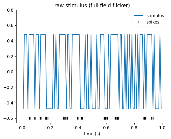
Finally, let’s plot one second of the time series. We can use the get method to extract a specific time interval.
import matplotlib.pyplot as plt

cell_idx = 2
plt.figure()

# Note: matplotlib conveniently uses stimulus.t (the index) as the x-axis.
plt.plot(stimulus.get(0, 1), label="stimulus")

# Overlay the spike raster at y=-0.6
plt.plot(units[cell_idx].get(0, 1).fillna(-0.6), "|", color="k", label="spikes")

plt.title("raw stimulus (full field flicker)")
plt.ylim(-0.66, 0.8)
plt.xlabel("time (s)")
plt.legend()
plt.show()
Pre-processing#
A Poisson GLM predicts a spike count at each time bin from the stimulus in that bin (and, later, from the recent stimulus and spike history). For the model inputs and outputs to line up, we need three things:
Spike counts. The spike times must be converted to spike counts, since counts are what the Poisson GLM models.
Matched sampling. The stimulus must be re-sampled onto the same time bins as the counts, so that each count has exactly one stimulus value associated with it.
Temporal alignment. The time axes of the counts and the re-sampled stimulus must cover the same interval, so that bin
iof one corresponds to biniof the other.
Let’s start with alignment. Two time series are temporally aligned when they span the same interval. In pynapple, the interval covered by a time series is stored in its time_support attribute, a IntervalSet object: a collection of start/end pairs marking continuous recording epochs.
Since we did not pass a time support when constructing the time series, pynapple set each one to a single epoch spanning its full range. Let’s print and compare the supports of our two time series:
print("Stimulus\n========")
print("Time support:\n", stimulus.time_support)
print(
    "\nTime stamps range:\n"
    f"({float(stimulus.t[0]):.3f}, {float(stimulus.t[-1]):.3f})"
)


unit_ts_range = min(spks.t[0] for spks in units.values()), max(spks.t[-1] for spks in units.values())

print("\nUnits\n=====")
print("Time support:\n", units.time_support)
print(
    "\nSpike times range:\n"
    f"({float(unit_ts_range[0]):.3f}, {unit_ts_range[1]:.3f})"
)
Stimulus
========
Time support:
   index      start      end
      0  0.0083406  1201.47
shape: (1, 2), time unit: sec.

Time stamps range:
(0.008, 1201.472)

Units
=====
Time support:
   index      start      end
      0  0.0178094  1201.45
shape: (1, 2), time unit: sec.

Spike times range:
(0.018, 1201.454)
As we can see, the supports do not match: the spikes extend beyond the window in which the stimulus was actually presented. Before doing anything else, we align the two by restricting the units time series to the stimulus support. That is exactly what the restrict method is for.
units = units.restrict(stimulus.time_support)
units.time_support
  index      start      end
      0  0.0083406  1201.47
shape: (1, 2), time unit: sec.
Two things happened here: every spike that fell outside the stimulus support was dropped, and the time support of units was replaced by that of stimulus. The two series now span the same interval.
With the supports aligned, we can convert the spike times to counts using the count method of TsGroup. Given a bin size, count tiles the time_support with uniform bins and counts the spikes falling in each one. We choose a bin size equal to the stimulus frame interval, so that the counts will share the stimulus’s native resolution.
bin_size = stimulus.t[1] - stimulus.t[0]
counts = units.count(bin_size, stimulus.time_support)
counts
Time (s)                0    1    2    3
--------------------  ---  ---  ---  ---
0.012510907499999998    0    0    0    0
0.0208515125            1    1    0    0
0.0291921175            0    0    0    0
0.0375327225            0    0    0    0
0.0458733275            0    0    1    2
0.0542139325            0    0    2    2
0.0625545375            0    0    1    1
...
1201.4182769225         0    0    0    0
1201.4266175275         2    2    0    0
1201.4349581325         1    0    0    0
1201.4432987374998      1    0    0    0
1201.4516393425         1    1    0    0
1201.4599799475         0    0    0    0
1201.4683205525         0    0    0    0
dtype: int64, shape: (144050, 4)
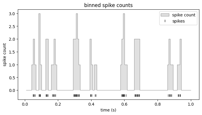
The counts are now regularly binned over the whole time support. Let’s plot the counts overlaid with the spike times.
ax = plot_counts(counts[:, cell_idx], (0, 1), title="binned spike counts")
ax.plot(units[cell_idx].get(0, 1).fillna(-0.2), "|", color="k", label="spikes")
ax.legend()
plt.show()
The last step is to put the stimulus on these exact bins. We do this with value_from, which, for every timestamp in counts.t, looks up a value from the stimulus. Using mode="before" picks the most recent stimulus sample at or before each count bin, which is the causally correct choice: the count in a bin can only be driven by stimulus that has already been presented, never by a future frame.
# for every sample i, take the most recent stimulus value at or before counts.t[i]
stimulus = counts.value_from(stimulus, mode="before")
stimulus
Time (s)
--------------------  -----
0.012510907499999998  -0.48
0.0208515125           0.48
0.0291921175           0.48
0.0375327225           0.48
0.0458733275          -0.48
0.0542139325           0.48
0.0625545375           0.48
...
1201.4182769225       -0.48
1201.4266175275       -0.48
1201.4349581325       -0.48
1201.4432987374998    -0.48
1201.4516393425       -0.48
1201.4599799475        0.48
1201.4683205525        0.48
dtype: float64, shape: (144050,)
And that’s it: counts and stimulus are now aligned to the same interval, sampled on the same bins, and ready for GLM modeling.
Building the design matrix#
Now it’s time to build the design matrix for our model. The predictor we want is the recent stimulus history over a fixed window of \(w\) samples: to predict the spike count \(y_t\) at time \(t\), we use the stimulus values \(s_{t-1},\dots, s_{t-w}\) that precede it.
The resulting design matrix looks like this,
Two things to notice: 1) \(X\) has \(T-w\) rows, where \(T\) is len(stimulus), because we need at least \(w\) stimulus values to fill a row. 2) Each row is a shifted copy of the row above.
A convenient way to construct this design matrix is to convolve the stimulus with an identity matrix. In NeMoS, convolution with the identity is exactly what the HistoryConv basis does.
There is one subtlety to be aware of: convolving with the identity returns the columns in the reverse order relative to (1). The first column holds the most recent stimulus sample, and the last column the stimulus \(w\) samples in the past. Pillow’s original notebook reverses the columns to restore the left-to-right ordering of (1); we don’t bother, because the flipped design fits an equivalent model.
Why the flipped column order doesn’t matter
The GLM prediction is a linear combination of the design-matrix columns — a weighted sum \(\hat\eta_t = \sum_j w_j X_{t,j}\). Permuting the columns and applying the same permutation to the weights \(w_j\) leaves every term of that sum untouched, so the prediction, the likelihood, and the fitted model are all identical. Reversing the columns is just the special case where that permutation is a flip. Fitting on the natural HistoryConv design and fitting on Pillow’s reversed design therefore yield the same model, with the recovered filters related by that same flip.
The only place this surfaces is plotting. Because we keep the columns in HistoryConv order, the fitted filter (and the STA below) comes out time-reversed relative to Pillow’s figures. Whenever we plot a filter or STA against lag time we flip it back with [::-1], purely so our plots line up with the original notebook’s convention — it has no effect on the fit itself.
import nemos as nmo

# Match the original notebook
window_size = 25

# define the basis object, shift = False means that
bas = nmo.basis.HistoryConv(window_size, conv_kwargs={"shift": False})

# Convolve with the identity
X = bas.compute_features(stimulus)
/opt/hostedtoolcache/Python/3.12.13/x64/lib/python3.12/site-packages/pynapple/core/utils.py:198: UserWarning: Converting 'd' to numpy.array. The provided array was of type 'ArrayImpl'.
  warnings.warn(
As you can see:
The design matrix is still a
pynappleobject: the time-series information is preserved, including the time axis and the time support.Xhas the same number of samples asstimulus. The convolution itself runs invalidmode, which produces only \(T - w\) values, butNeMoSpads the result with NaNs back to length \(T\). This keepsXandcountsaligned.
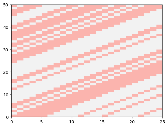
Plotting a slice of X makes the column order concrete: reading each row left to right, the leftmost column is the most recent stimulus sample and the rightmost is the stimulus \(w\) samples in the past — the reverse of (1), as noted above.
plt.pcolormesh(X[window_size:window_size+50], cmap="Pastel1")
plt.show()
Compute and visualize the spike-triggered average (STA)#
When the stimulus is white noise, the STA is an unbiased estimator of the filter in a GLM / LNP model, as long as the nonlinearity yields an STA whose expectation is nonzero. (Feel free to skip this technical aside: it simply means that a symmetric nonlinearity, e.g. \(x^2\), breaks the condition and the STA becomes uninformative.)
Even when your stimulus is not white noise, it is often worth visualizing the STA: if it shows no structure at all, that is a sign something has gone wrong upstream, for example a mismatch between the design matrix and the binned spike counts. Note that for plotting we will reverse the STA array to match the convention of the original notebooks.
import numpy as np

neuron_counts = counts[:, cell_idx]

# Drop the NaN-padded rows of the design matrix, then align the counts to the
# bins that remain via their shared time support.
X_valid = X.dropna()
counts_valid = neuron_counts.restrict(X_valid.time_support)

# Note: transposition isn't defined for pynapple objects, so we use the data
# attribute `d` (a numpy array) for the matrix algebra. We normalize by the
# total spike count, following the standard STA definition.
sta = (X_valid.d.T @ counts_valid.d) / neuron_counts.sum()

lag_times = np.arange(-window_size+1,1) / neuron_counts.rate  # time bins for STA (in seconds)

plt.figure()
plt.axhline(0, color="0.7", linestyle="--")
# revert to match the original notebook convention
plt.plot(lag_times, sta[::-1], "o-", color=PALETTE[0])
plt.title("STA")
plt.xlabel("time before spike (s)")
plt.xlim([lag_times[0],lag_times[-1]])
plt.show()
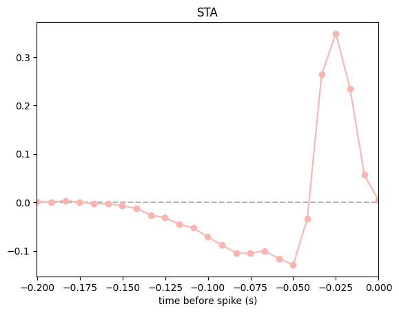
Why is our STA shifted by one bin from the original tutorial?
If you put this STA side by side with the one in Pillow’s original notebook, you’ll notice ours is shifted by one bin: the peak sits one sample closer to zero lag. The two are otherwise identical, and reconciling them is instructive — the shift is a small, concrete example of a general issue: how you align the spike counts to the stimulus in time directly shapes what you read off the result.
The shift happens because the two pipelines anchor the spike histogram differently. In this dataset the stimulus frames are timestamped at dt, 2·dt, 3·dt, … (stim_times[0] == dt). The original notebook bins spikes on a grid anchored at zero (np.arange(num_time_bins+1) * dt), so its bins are offset by one frame from where the stimulus actually starts. Here we let count anchor the bins at the stimulus support (which starts at stim.t[0] == dt) and use value_from(..., mode="before") to pick the most recent frame at or before each bin, so the counts and the stimulus stay genuinely aligned in time.
At this bin size (~8 ms) the one-sample difference is negligible and doesn’t change the shape of the filter or any conclusion we draw from it. But the size of the error is one bin whatever the bin size is: with coarser bins, the same misalignment would move the estimated STA peak by that much more, and could meaningfully distort the timing you report. This is exactly why pynapple is so handy — it tracks the real timestamps and gives you fine control over binning and resampling, so alignment is something you set deliberately rather than get by accident.
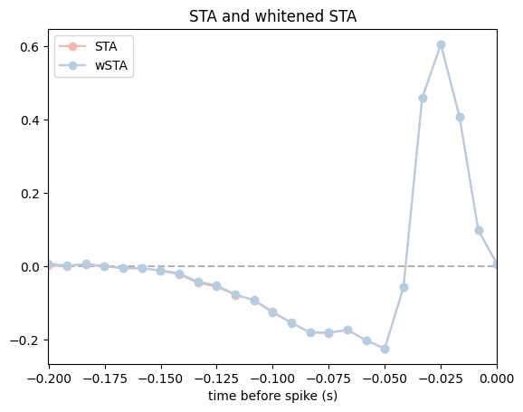
Whitened STA#
If the stimuli are non-white, then the STA is generally a biased estimator for the linear filter. In this case we may wish to compute the “whitened” STA, which is also the maximum-likelihood estimator for the filter of a GLM with “identity” nonlinearity and Gaussian noise (also known as least-squares regression or linear regression).
If the stimuli have correlations this ML estimate may look like garbage (more on this later when we come to “regularization”). But for this dataset the stimuli are white, so we don’t (in general) expect a big difference from the STA (this is because X.T @ X is close to a scaled version of the identity).
# Whitened STA (or linear regression via the analytical formula)
wsta = np.linalg.pinv(X_valid.d.T @ X_valid.d) @ sta * neuron_counts.sum()

plt.figure()
plt.axhline(0, color="0.7", linestyle="--")
# flip with [::-1] to match the original notebook convention
plt.plot(lag_times, sta[::-1]/np.linalg.norm(sta), "o-", color=PALETTE[0], label="STA")
plt.plot(lag_times, wsta[::-1]/np.linalg.norm(wsta), "o-", color=PALETTE[1], label="wSTA")
plt.title("STA and whitened STA")
plt.xlabel("time before spike (s)")
plt.xlim([lag_times[0],lag_times[-1]])
plt.legend()
plt.show()
Rate prediction with a linear-Gaussian GLM#
The whitened STA can actually be used to predict spikes because it corresponds to a proper estimate of the model parameters (i.e., for a Gaussian GLM). Let’s inspect this prediction.
# Predicted spikes from linear-Gaussian GLM
pred_lin_gauss = X @ wsta

# get the first 1sec of non-nans
first_valid_time = pred_lin_gauss.dropna().t[0]
ep_1sec = first_valid_time, first_valid_time + 1

plot_counts(
    neuron_counts,
    ep_1sec,
    [(pred_lin_gauss, "lgGLM")],
    title="linear-Gaussian GLM: spike count prediction",
    ylim=(-1.2, 4),
)
plt.show()
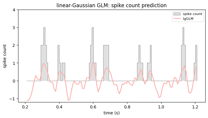
We can clearly see that we forgot to include an offset or “intercept” term to our design matrix, which will allow our prediction to have a non-zero mean (since the stimulus here was normalized to have zero mean).
# Add an offset (constant column in the design)
X_offset = np.hstack([np.ones_like(neuron_counts)[:, None], X])
X_offset_valid = X_offset.dropna()

# Compute the linear-Gaussian ML estimator
XTX_inv = np.linalg.pinv(X_offset_valid.d.T @ X_offset_valid.d)
wsta_offset = XTX_inv @ (X_offset_valid.d.T @ counts_valid.d)

# split into intercept and coefficients
intercept = wsta_offset[0]
wsta_offset = wsta_offset[1:] # the linear filter part

# Compute prediction with offset
pred_lin_gauss_offset = intercept +  X @ wsta_offset

plot_counts(
    neuron_counts,
    ep_1sec,
    [
        (pred_lin_gauss, "lgGLM"),
        (pred_lin_gauss_offset, "lgGLM + offset"),
    ],
    title="linear-Gaussian GLM: spike count prediction",
    ylim=(-1.2, 4),
)
plt.show()

# Let's report the relevant training error (squared prediction error on
# training data) so far just to see how we're doing:
mse1 = np.nanmean((neuron_counts.d - pred_lin_gauss)**2)   # mean squared error, GLM no offset
mse2 = np.nanmean((neuron_counts.d - pred_lin_gauss_offset)**2)  # mean squared error, with offset
rss = np.nanmean((neuron_counts.d - np.mean(neuron_counts))**2)    # squared error of spike train
print("Training perf (R^2): lin-gauss GLM, no offset: {:.2f}".format(1-mse1/rss))
print("Training perf (R^2): lin-gauss GLM, w/ offset: {:.2f}".format(1-mse2/rss))
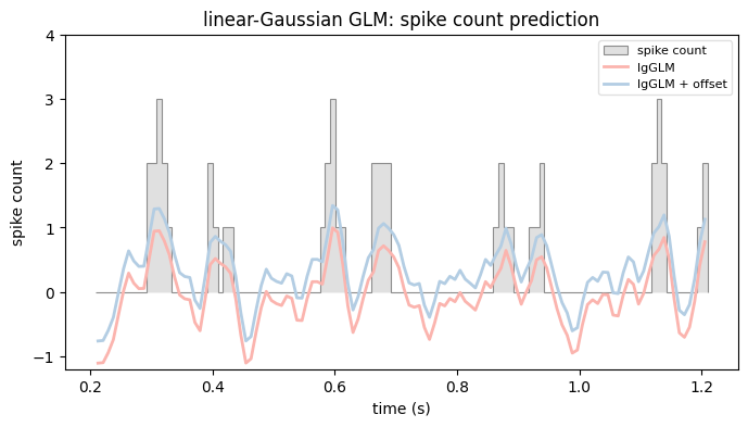
Training perf (R^2): lin-gauss GLM, no offset: 0.12
Training perf (R^2): lin-gauss GLM, w/ offset: 0.39
Linear-Gaussian GLM with NeMoS#
We just computed the whitened STA by hand, with the least-squares formula. That estimate is the maximum-likelihood filter of a GLM with a Gaussian noise model and an identity link. NeMoS can fit that same model for us, so let’s check that the two agree.
# Define a model object
gaussian_glm = nmo.glm.GLM(observation_model="Gaussian", solver_name="BFGS")
gaussian_glm.fit(X, neuron_counts)
gaussian_glm
GLM(
    observation_model=GaussianObservations(),
    inverse_link_function=identity,
    regularizer=UnRegularized(),
    solver_name='BFGS'
)
In a Jupyter environment, please rerun this cell to show the HTML representation or trust the notebook. On GitHub, the HTML representation is unable to render, please try loading this page with nbviewer.org.
Parameters
| observation_model | GaussianObservations() | |
| inverse_link_function | <function <la...x7f6170bc8720> | |
| regularizer | UnRegularized() | |
| solver_name | 'BFGS' | |
| solver_kwargs | {} | |
| regularizer_strength | None |
Fitted attributes
| Name | Type | Value |
|---|---|---|
| aux_ | NoneType | None |
| coef_ | ArrayImpl[float64](25,) | Array([ 0.004...dtype=float64) |
| dof_resid_ | ArrayImpl[float64](1,) | Array([144049...dtype=float64) |
| intercept_ | ArrayImpl[float64](1,) | Array([0.3467...dtype=float64) |
| scale_ | ArrayImpl[float64](1,) | Array([0.2764...dtype=float64) |
| solver_state_ | OptimistixAdapterState | OptimistixAda...k_bool[] ) ) |
As we can see, all we had to set is the observation model to Gaussian, default would be Poisson. Since the inverse link function is the identity by default, the model we just fit is a linear regression.
Let’s plot the predictions and compare the resulting coefficients with the one obtained via the analytical formula.
pred_lin_gauss_nemos = gaussian_glm.predict(X)

plot_counts(
    neuron_counts,
    ep_1sec,
    [
        (pred_lin_gauss, "lgGLM"),
        (pred_lin_gauss_offset, "lgGLM + offset"),
        (pred_lin_gauss_nemos, "lgGLM nemos", None, "--"),
    ],
    title="linear-Gaussian GLM: spike count prediction",
    ylim=(-1.2, 4),
)
plt.show()

mse_nemos = np.nanmean((neuron_counts.d - pred_lin_gauss_nemos)**2)
print("Training perf (R^2): lin-gauss GLM, nemos: {:.2f}".format(1-mse_nemos/rss))
/opt/hostedtoolcache/Python/3.12.13/x64/lib/python3.12/site-packages/pynapple/core/utils.py:198: UserWarning: Converting 'd' to numpy.array. The provided array was of type 'ArrayImpl'.
  warnings.warn(
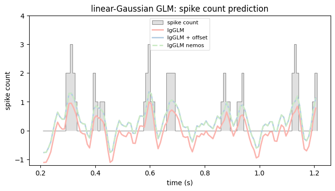
Training perf (R^2): lin-gauss GLM, nemos: 0.39
Poisson GLM#
The linear-Gaussian model treats spike counts as continuous and lets the prediction go negative, which is not what counts do. The Poisson GLM fixes this: it models the counts as Poisson, and passes the linear prediction through an exponential nonlinearity so the predicted rate is always positive. Fitting it takes the same two lines as before; the only change is the observation model, which is Poisson by default.
# Poisson is the default observation model, so there is nothing to set here.
exp_poisson_glm = nmo.glm.GLM(solver_name="BFGS").fit(X, neuron_counts)
exp_poisson_glm
GLM(
    observation_model=PoissonObservations(),
    inverse_link_function=exp,
    regularizer=UnRegularized(),
    solver_name='BFGS'
)
In a Jupyter environment, please rerun this cell to show the HTML representation or trust the notebook. On GitHub, the HTML representation is unable to render, please try loading this page with nbviewer.org.
Parameters
| observation_model | PoissonObservations() | |
| inverse_link_function | <function exp...x7f6170bc8040> | |
| regularizer | UnRegularized() | |
| solver_name | 'BFGS' | |
| solver_kwargs | {} | |
| regularizer_strength | None |
Fitted attributes
| Name | Type | Value |
|---|---|---|
| aux_ | NoneType | None |
| coef_ | ArrayImpl[float64](25,) | Array([ 0.003...dtype=float64) |
| dof_resid_ | ArrayImpl[float64](1,) | Array([144049...dtype=float64) |
| intercept_ | ArrayImpl[float64](1,) | Array([-1.939...dtype=float64) |
| scale_ | ArrayImpl[float64](1,) | Array([1.], dtype=float64) |
| solver_state_ | OptimistixAdapterState | OptimistixAda...k_bool[] ) ) |
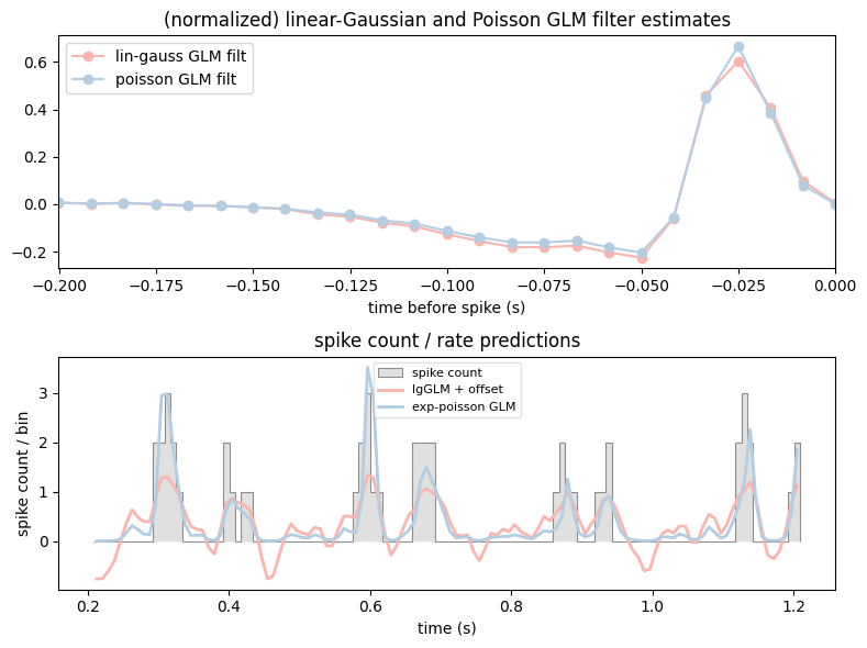
The predicted rate comes from the same predict method. Let’s compare the two filters and their predictions side by side.
rate_exp_poisson_glm = exp_poisson_glm.predict(X)


fig, (ax1,ax2) = plt.subplots(2, figsize=(8, 6))

# flip the filters with [::-1] to match the original notebook convention
ax1.plot(lag_times, gaussian_glm.coef_[::-1]/np.linalg.norm(gaussian_glm.coef_), "o-", label="lin-gauss GLM filt", c=PALETTE[0])
ax1.plot(lag_times, exp_poisson_glm.coef_[::-1]/np.linalg.norm(exp_poisson_glm.coef_), "o-", label="poisson GLM filt", c=PALETTE[1])
ax1.legend(loc = "upper left")
ax1.set_title("(normalized) linear-Gaussian and Poisson GLM filter estimates")
ax1.set_xlabel("time before spike (s)")
ax1.set_xlim([lag_times[0], lag_times[-1]])

plot_counts(
    neuron_counts,
    ep_1sec,
    [
        (pred_lin_gauss_nemos, "lgGLM + offset"),
        (rate_exp_poisson_glm, "exp-poisson GLM"),
    ],
    title="spike count / rate predictions",
    ylabel="spike count / bin",
    ax=ax2,
)
plt.tight_layout()
plt.show()
/opt/hostedtoolcache/Python/3.12.13/x64/lib/python3.12/site-packages/pynapple/core/utils.py:198: UserWarning: Converting 'd' to numpy.array. The provided array was of type 'ArrayImpl'.
  warnings.warn(
Non-parametric estimate of the nonlinearity#
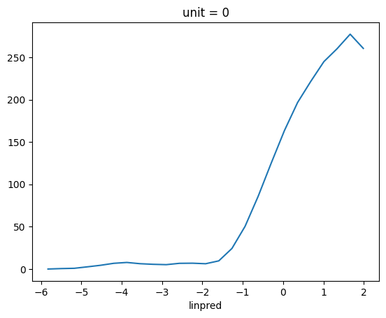
A way to estimate the non-linearity from the data is computing the filtered stimulus (the rate before the non-linearity is applied), bin it over the range, and compute the mean firing rate per each bin. What I just described is just a tuning curve, and pynapple has built-in functions for this.
# The filtered stimulus is the GLM's linear predictor: its output *before* the
# nonlinearity, i.e. X @ coef + intercept.
raw_filter_output = X @ exp_poisson_glm.coef_ + exp_poisson_glm.intercept_

# Binning that against the spikes and averaging per bin is exactly a tuning curve.
tc = nap.compute_tuning_curves(units[cell_idx], raw_filter_output.dropna(), bins=25, feature_names=["linpred"])

tc.plot()
plt.show()
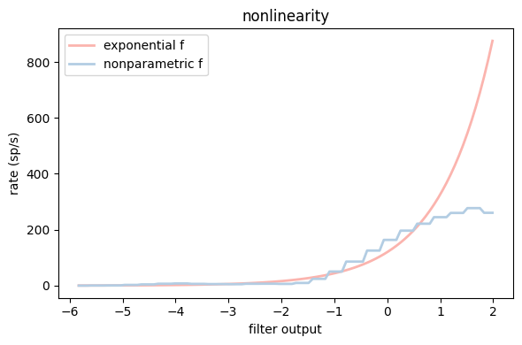
Let’s convert our tuning curve to a function by nearest-neighbor interpolation, using a simple jax reimplementation of scipy.interp1d with kind="nearest" and fill_value="extrapolate". We then plug it straight into a GLM as the inverse link function, reusing the exp-GLM’s fitted filter rather than refitting.
Why not use scipy.interp1d directly?
scipy.interp1d works fine for plotting, but it can’t be used as an inverse_link_function in a NeMoS GLM. NeMoS validates the link function by JIT-compiling it and taking its gradient, so the function has to be written in jax — hence the small reimplementation above.
That validation is also why the body looks slightly fussier than a plain lookup. NeMoS may call the link function on a scalar (0-D) input, so we jnp.atleast_1d the argument to keep the x[:, None] broadcasting valid, and jnp.squeeze the result so a 0-D input still returns a 0-D output. A bit of boilerplate, but it’s the typical price of supplying a custom, traceable nonlinearity.
import jax.numpy as jnp

# bins per second: converts between spikes/bin (the GLM's units) and spikes/s.
rate_hz = neuron_counts.rate

# Build a jax interpolator from the tuning curve.
xp = jnp.array(tc.linpred.values)
fp = jnp.array(tc.values[0])
def nearest_interp(x):
    """Nearest-neighbor interpolation, extrapolates by repeating boundary values."""
    x = jnp.atleast_1d(x) # make sure that [:, None] works even for 0-D arrays
    idx = jnp.argmin(jnp.abs(x[:, None] - xp[None, :]), axis=1)
    return jnp.squeeze(fp[idx]) # make sure that 0-D array returns 0-D

# A Poisson GLM whose nonlinearity *is* the estimated tuning curve. The curve is
# in spikes/s, so we divide by rate_hz to get the GLM's spikes/bin. We set the
# link at construction and reuse the exp-GLM's fitted filter instead of refitting.
np_poisson_glm = nmo.glm.GLM(inverse_link_function=lambda x: nearest_interp(x) / rate_hz)
np_poisson_glm.coef_ = exp_poisson_glm.coef_
np_poisson_glm.intercept_ = exp_poisson_glm.intercept_
np_poisson_glm.scale_ = exp_poisson_glm.scale_

# Plot exponential and nonparametric nonlinearity estimate
fig, ax = plt.subplots(1, figsize=(6,4))
x = np.linspace(tc.linpred.values[0], tc.linpred.values[-1], 100)
ax.plot(x, np.exp(x) * rate_hz, label="exponential f", c=PALETTE[0], lw=2)
ax.plot(x, nearest_interp(x), label="nonparametric f", c=PALETTE[1], lw=2)
ax.set_xlabel("filter output")
ax.set_ylabel("rate (sp/s)")
ax.legend(loc="upper left")
ax.set_title("nonlinearity")
plt.tight_layout()
plt.show()
Quantifying performance: log-likelihood#
How well does each model actually describe the spikes? A natural measure is the log-likelihood: how probable the observed counts are under the rates the model predicts.
A raw log-likelihood is hard to read on its own, so we compare it against a baseline that ignores the stimulus and fires at a constant mean rate. The difference between the two log-likelihoods, divided by the number of spikes and converted to base 2, is the single-spike information: the bits per spike we gain by knowing the model’s rate rather than just the mean rate. See Brenner et al, “Synergy in a Neural Code”, Neural Comp 2000.
Computing it needs three pieces: the log-likelihood of each fitted GLM, the log-likelihood of the constant-rate baseline, and the total spike count. We’ll build them one at a time, working on the valid (non-padded) bins we already prepared earlier, X_valid and counts_valid.
For the first piece, the fitted GLMs, we use score. It returns the mean log-likelihood per sample, so we multiply by the number of samples to get the total.
n_samples = counts_valid.shape[0]

ll_exp = exp_poisson_glm.score(X_valid, counts_valid) * n_samples
ll_np = np_poisson_glm.score(X_valid, counts_valid) * n_samples
The second piece is the baseline: a homogeneous model firing at a constant rate equal to the mean spike count. It is not a fitted GLM, so there is no score to call. The log-likelihood itself, though, lives on the observation model — log_likelihood(observations, rate) — and also returns a per-sample mean, so again we multiply by n_samples.
mean_rate = np.mean(counts_valid) * np.ones(n_samples)
ll_null = exp_poisson_glm.observation_model.log_likelihood(counts_valid.d, mean_rate) * n_samples
print(f"null-model log-likelihood: {float(ll_null):.1f}")
null-model log-likelihood: -113522.8
Putting the pieces together, the single-spike information is the per-spike, base-2 difference between each model and the baseline.
n_spikes = counts_valid.sum()
ss_info_exp = float((ll_exp - ll_null) / n_spikes / np.log(2))
ss_info_np = float((ll_np - ll_null) / n_spikes / np.log(2))
print("\nempirical single-spike information:\n-----------------------------------")
print(f"exp-GLM: {ss_info_exp:.2f} bits/sp")
print(f" np-GLM: {ss_info_np:.2f} bits/sp")
empirical single-spike information:
-----------------------------------
exp-GLM: 1.11 bits/sp
 np-GLM: 1.20 bits/sp
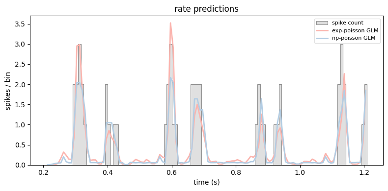
Finally, let’s compare the two rate predictions directly.
plot_counts(
    neuron_counts,
    ep_1sec,
    [
        (exp_poisson_glm.predict(X), "exp-poisson GLM"),
        (np_poisson_glm.predict(X), "np-poisson GLM"),
    ],
    title="rate predictions",
    ylabel="spikes / bin",
)
plt.tight_layout()
plt.show()
Quantifying performance: AIC#
Single-spike information rewards a model for fitting the spikes, but says nothing about how many parameters that fit cost. A more flexible model can always match the data better, so to compare models fairly we need a criterion that charges for complexity. The Akaike Information Criterion (AIC) does exactly that:
where \(k\) is the number of free parameters; lower is better. Our two Poisson models share the same filter (an intercept plus the window_size weights) and differ only in the nonlinearity: the exponential model adds no parameters, while the nonparametric model spends one per tuning-curve bin.
n_nonlin_bins = tc.linpred.size  # one parameter per tuning-curve bin

n_params_exp = 1 + window_size                 # intercept + filter
n_params_np = 1 + window_size + n_nonlin_bins  # + nonlinearity bins

aic_exp = float(-2 * ll_exp + 2 * n_params_exp)
aic_np = float(-2 * ll_np + 2 * n_params_np)

print(f"AIC  exp-GLM: {aic_exp:.1f}")
print(f"AIC   np-GLM: {aic_np:.1f}")
winner = "nonparametric" if aic_np < aic_exp else "exponential"
print(f"\nAIC favors the {winner} nonlinearity.")
AIC  exp-GLM: 150537.2
AIC   np-GLM: 143959.1

AIC favors the nonparametric nonlinearity.
Here the nonparametric model wins despite its extra parameters: the improvement in fit more than pays for them. One caveat — we never refit the filter for the nonparametric model (we reused the exponential GLM’s weights), so its log-likelihood is an underestimate. A proper joint fit of filter and nonlinearity would only widen the gap.
Simulating from the GLM#
A fitted GLM is a generative model: given a stimulus, it defines a firing rate and a Poisson process we can draw spikes from. NeMoS exposes this through simulate, which takes a random key and the feed-forward input and returns simulated spike counts together with the rate that generated them.
Drawing many repeats over the same stimulus window gives us a raster — the model’s analogue of repeating a stimulus across trials in an experiment.
# A short window of the (valid) design matrix to drive the simulation.
sim_window = X_valid.get(X_valid.t[0], X_valid.t[0] + 0.5)
n_repeats = 50

# One spike train per repeat, each with its own random key.
keys = jax.random.split(jax.random.key(0), n_repeats)
sim_spikes = np.stack([exp_poisson_glm.simulate(k, sim_window)[0] for k in keys])

fig, (ax_rate, ax_raster) = plt.subplots(
    2, figsize=(8, 5), sharex=True, height_ratios=[1, 3]
)
ax_rate.plot(exp_poisson_glm.predict(sim_window), color=PALETTE[0])
ax_rate.set_ylabel("rate (spikes/bin)")
ax_rate.set_title("simulated GLM responses")
ax_raster.imshow(
    sim_spikes, aspect="auto", cmap="Greys",
    extent=[sim_window.t[0], sim_window.t[-1], n_repeats, 0],
)
ax_raster.set_xlabel("time (s)")
ax_raster.set_ylabel("repeat #")
plt.tight_layout()
plt.show()
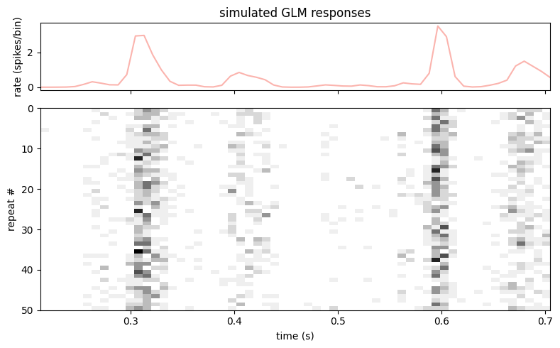
The simulated trains cluster where the predicted rate is high and thin out where it is low: the model reproduces the temporal structure of the response, not just the average rate.